Many of us heard about the possibility that Borders could go under and now word comes through that they filed for bankruptcy in New York after four years of sales declines, and now plans to shut about 40 percent of its superstores in the next several weeks. Both Borders and Barnes & Noble have been struggling to adapt in this digital age up against newcomers Apple and Amazon. While I am not one to speculate as to why the company itself has struggled, one area that I can comment on is their Web presence which, as a Web Manager of a book website, I have been observing with keen interest.
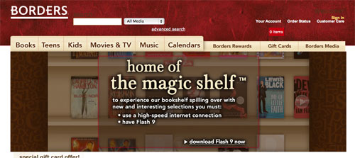
The Borders website has been through a few iterations over the past couple of years. My relationship with them officially started in 2006 and during this time, Borders had opted for a very visual, image-based website. Prior to this time it looks as though they have had a fairly primitive website, then they teamed up with Amazon for many years before once again striking out of their own. I recall the Magic Bookshelf dominating their website which I thought was pretty cool at the time.
Border’s latest iteration is more stripped-down and reminds me a bit of Amazon. It’s a lot cleaner, better organized and seems more focussed on doing what it is they do. They’ve also incorporated several essential social elements in their design which is also a notable plus. It’s still a little image-heavy for my liking but that shouldn’t be a big hindrance for SEO.
So let’s have a quick browse through some SEO elements to see how they stack up.
The Home page URL is a strange one right off the bat. Having a well organized site structure is key and already we’re 2 deep with “Online” and “Store” incorporated in the home page string. At least they have set up the <link rel=”canonical” href=”http://www.borders.com”/> but we’re already going in circles. The primary domain is chosen as www and they are redirecting. They’ve at least covered a couple of basic best practices it seems.
Digging a little further we see the poor domain structure continue. The Gift Cards URL looks something like http://www.borders.com/online/store/BGIView_giftcards. Certainly not optimal and with the inclusion of an underscore instead of a hyphen, already we’re pretty sure that no SEO has been consulted here. Further in and it gets even worse. Kids New Releases looks like a dogs breakfast http://www.borders.com/online/store/Landing?view=2&type=1&kids=true&nav=5185+501363+5215&simple=false. I don’t care if Sergey Brin himself says that they have no problem crawling URL’s with parameters, they are at a significant disadvantage for many reasons but at the very least by excluding keywords as part of the URL. Not only that but I’m not about to link to that page because it’s painful so they’ll lose a few incoming links.
So drilling into a specific book, let’s go with Silverlicious by Victoria Kann. My URL is still a horrid mess http://www.borders.com/online/store/TitleDetail?sku=0061781231&id=61293569, my title tag is pretty weak but OK with Silverlicious – Victoria Kann – Hardcover (ISBN 9780061781230) – Buy Books, Music and Movies at Borders. I’m also not seeing any category organization, no breadcrumb trail, the book description is pretty light…any longtail benefits I’d hope to achieve is going to be a tough ask. Let’s just have a quick glance at Amazon’s URL for the same item http://www.amazon.com/Silverlicious-Pinkalicious-Victoria-Kann/dp/0061781231/. That’s already better. Rather than go on, I’m going to suggest that all this simply points to the fact that very little thought had gone into SEO during web development.
I’m pretty doubtful that SEO would have had saved the business. There’s obviously more to it than that. It just irks me that all this thought and planning and funds that goes into developing a website and a pretty crucial component would be ignored. Oh and what do I get when I Google “Silverlicious by Victoria Kann? Not Borders.


This article is excelent!